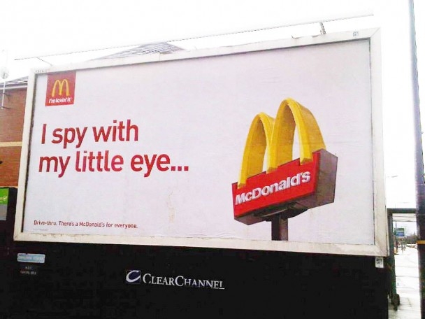
It’s a great example of how outdoor advertising should be created.
You have 5 to 10 seconds to grab attention and leave an impression – and this simple execution does that. OK I know it’s for a brand we all know extremely well, but it’s enhanced by the ‘I spy my little eye…’ headline which reminds us all of those long car journeys as a child – linking exquisitely with their TV proposition.
And does it work? – Too right it does. I had to fight back the craving for a McBurger of some description all afternoon.
If I wanted to be picky i would just question why you need the McDonalds logo on the poster at all? The Golden Arches sign says it all…
Do think Azko Nobel should give Clear Channel some white Sandtex paint though – the poster frame is looking a bit weathered! Perhaps we’ll get our new head of marketing to look at that one?


