At Access we create branding and corporate identity. We’re busy and the pace is quick, so every now and then I think it’s really important to step back and take a look at your inspirations. Here’s one of mine.
So who is Vignelli?
He’s an Italian born designer that back in the late 60’s headed up the New York branch of Unimark, a design company that he’d set up with his peers. Vignelli pushed and shaped early corporate identity design, seeing himself not so much as a designer but as an architect of communication. Modernist grid systems that bravely used white space like nobody dared use before, coupled with Swiss typography (namely Helvetica) found their way into popular culture. He’s the man behind branding and logo marques for Bloomingdales, American Airlines (only just updated after 45 years!), Ford, Gillette, and in later years Benetton and IBM.
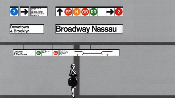
The work Vignelli undertook for the New York Subways are stand out pieces for me. The wayfinding system is based around delivering the information at the point at which you make the decision; Which line? Which direction? It seems simple now, but back then this was pioneering. The 1972 redesign of the New York subway map is, for me, a classic piece of design. The basic principles of lines running at 45 and 90 degree angles as established by Harry Beck’s London Tube map are present.
However, Vignelli’s is a modern work of art, the train lines in 1970’s rainbow colours, the parks and rivers offset in muted warm grey tones, and in bold modern typography (Standard Medium ‘pushed together’) the neighbourhoods of Manhattan, Queens, Brooklyn and The Bronx are shouted out. Beautiful!
What’s important about Vignelli for me is that his influences are today found the world over, in brochures and posters, in web and app design, to dare I say, even Apple’s iOS.
Had he seen the future?
It seems quite canny that in 1991 Vignelli held a talk and exhibition about the future of design in the digital age. He expressed concern that the digital revolution would give rise to the creation of thousands of new fonts and we would become visually‘polluted’. Interesting then, that in designing corporate identities of recent times we’ve relied solely on a handful of ‘browser safe’ fonts similarly echoing Vignelli’s foresight.


