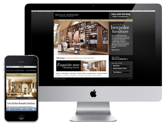
The shift towards mobile browsing is well documented with the number of mobile internet users expected to surpass desktop users by 2015. 39% of UK adults now own a smartphone1. We're seeing this trend in our own clients' websites and with NevilleJohnson.co.uk generating high volumes of 'consumer' traffic, the business case for a better mobile experience was particularly strong.
Working with our client we explored the best ways to build on and adapt their already successful Drupal 'desktop' site, with a particular focus on the user experience and how we could provide an interface designed especially for smaller, touch-enabled devices.
What does analytics show us?
One of the first steps we took was to look at the Google Analytics data in more detail, to see what it could tell us about the existing mobile audience. It showed which areas of the site were the most popular and which were under performing for mobile visitors. It also gave us an insight in to the range of handsets being used by these visitors which would prove useful later on.
Following the analysis phase the client made a business decision to focus the mobile site on the domestic furniture market and serve up a limited catalogue of products.
Scoping
With the Analytics data digested, and a clear focus on what content, products and features we needed to promote, we then set about defining our approach. A revised sitemap, wireframe layouts, annotated user journey and design visuals helped to demonstrate what would be delivered whilst agreeing with the client that we'd have opportunity to refine and adapt the detailed behaviour and interface detail once we got into the build phase - this is particularly important when designing for 'touch'.
Implementation approach
 We assessed options including creating a dedicated mobile app, a stand-alone mobile website and the development of a responsive skin that morphs to suit the device being used. However, the approach we settled on leveraged the nifty Drupal module Mobile Tools which detects the visitor's device and then displays the website with the relevant theme (skin) enabled. We made this decision as it offered a good balance between speed/cost of development, ease of content management and the freedom to provide separate experiences for desktop and mobile.
To facilitate the limited product catalogue on the mobile site we added a checkbox to each product to select whether it should appear or not. Mobile-specific Views then filtered the products accordingly. We also created shortened menu blocks that were configured to only display on the mobile theme to take the place of the full primary links usually found on the desktop site. Many images are automatically resized and cropped by ImageCache to optimize them for display in the mobile theme.
Besides these configuration differences, the mobile site content is effectively the same as the desktop. There is no duplication of effort in the content management process.
Designing for touch
Touch-enabled devices were a key consideration when we came to design the mobile theme for Neville Johnson. We wanted to provide a tactile experience that has an app-like feel. We achieved this by adopting an interlocking block layout where navigation elements are oversized for easy pressing and galleries are swipeable with a finger. Every pixel is precious so the main navigation contracts into the top corner out of the way. For a closer look at the products click Zoom and the full screen image gallery (powered by Photo Swipe) springs up.

 Try it for yourself
The Neville Johnson mobile site is now live so you can try it out for yourself. Simply visit www.nevillejohnson.co.uk on your smart phone of scan this QR code to jump straight there.
For more info about our work for Neville Johnson, read the desktop website case study.
1. Source: Ofcom research, Q1 2012


